On Noah’s recent trip to Austin I introduced him to a friend who’s a huge player in the viral marketing field. Now he runs a big media company yadda yadda, and showed us some of his tactics.
One of the things he’s absolutely fanatical about is optimizing his checkout forms. Whether for buying a product, filling out an email form….basically anything with a customer text entry box…he does massive amounts of multi-variate testing to see which layout, which font, which words, which images, which checkout flow, which spacing etc. results in the highest amount of successful transactions.
Now his market and sales are much different than mine on HouseOfRave, but something can be learned from this.
SO I decided to take a page from his book and for the first time EVER….optimize the checkout form on HoR.
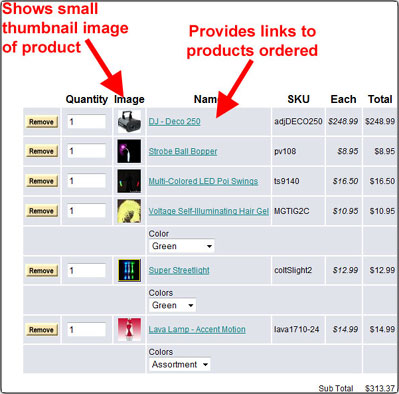
I was actually quite horrified at how bad it was. The colors made me wanna throw up, there were no links to see the products you were buying, there were some confusing forms, some unnecessary fields and more simple fixes that had remained untouched for years.
Thanks to the recent upgrade of Shopsite I have the ability to change my forms a lot more. I realized that a lot of these names are strange to people and they have no idea what they’re getting when they press “Checkout.” Fortunately I can now add links and images on the shopping cart, which lets people know what they’re getting. Now when someone adds something to the shopping cart it looks something like this:
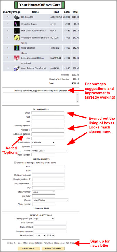
When people checkout they now see something like this:
There’s a lot of very minor changes in this new form such as the addition of writing “Optional” on the ‘Address 2’ field. Despite most people knowing this is where you’d enter an apartment number or office number, some people not familiar with online commerce scratch their heads wondering why they need to enter a 2nd address. Clearly writing “Optional” instead of simply denoting it with an *asterisks* should help.
I also want people to give suggestions in the comment box, so I wrote that. I want to change it soon to include something like “Why are you buying these products?” so I can more clearly understand what market I’m catering to (Hint: hardly anyone actually buys from the site for raves…it’s kind of counter-intuitive).
There were also little things like lining up the text entry boxes correctly so it looks neat.
If you can spot any confusing parts of the form or have suggestions, please let me know. I also plan on doing this sometime soon:
Allowing all the readers of this blog to place test orders on the site and send me feedback on what they thought was confusing or could be improved. I’ll try to get that test out sometime this month.
There’s still a lot of work to do, but simply paying some attention to the things I’ve overlooked for so long has already made a world of difference.

