Although I rarely watch CNBC anymore, I like when they profile big companies like WalMart. Today I saw a profile about the start and growth of McDonalds.
It showed how the McDonald brothers had a small chain of restaurants until Ray Croc (a milkshake machine salesman of all things) bought them out. He started replicating the McDonalds business model all over the nation then globe, but the thing he was fanatical about was consistency.
He wanted all McDonald’s stores to have a proper look and feel to them to make customers familiar with them, therefore more inclined to buy from them. I’m not selling hamburgers, but having a “put together” business to make people feel comfortable is a good idea for any business.
This somehow ties into my recent plan to start making HouseOfRave more consistent and “put together” to appear more professional. I’ve started working with a more professional supplier, and therefore I need to make the site more professional and consistent. This doesn’t mean necessarily re-designing the site, but just making everything more congruent.
I went from somehow watching a special about McDonalds (which I then proceeded to eat at) to snooping around my own website trying to view it from a brand new visitors perspective. One of the first things I noticed was the 2nd top-level navigation menu button “Catalog” was horribly designed and outdated by several YEARS.
This is a highly clicked page, and some of the category links on this page had dead links, and many of them have been changed or removed over the years. This could easily turn a potential customer away. I immediately started working on this and cranked out 18 custom category images. I use Photoshop all the time, so this went relatively quick..but was very boring. Now instead of writing “Battery Operated Section” and including a small 75×75 pixel product image from that category, it now has a proper image associated with it. So the battery operated section of the catalog has this image:
It has a more congruent feel with the website and more thoroughly conveys what that section contains. A portion of the images used were actually taken by me in previous product photo shoots. For example, the only non-mine image above are those finger lights, that’s just a standard manufacturers picture.
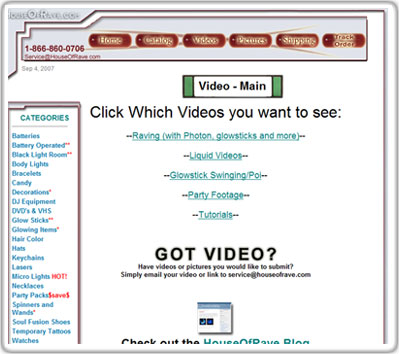
Another thing I quickly noticed on the top menu bar was another high-traffic page which has been neglected for some time. The video section leads to a page that looks like this:
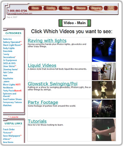
It’s meant as the video landing page where you can select between five different types of videos. This section has been around a long time and has proved to be pretty popular, so I figured I should at least jazz it up with a few small images. So I quickly added a few and it looks like this now:
I’m not 100% happy with that look, but it’s slightly more engaging now.
So these are just two small changes I’ve made to make the site look more congruent and put together. The ultimate goal is not to have the best designed site around, but to make potential customers feel comfortable enough to order from it.
Since I see the site everyday from the owners view, I focus on different things than customers. I need to start patrolling around the site more often with a different perspective to catch other obvious errors and areas that could use improvement. That will be my main objective for HouseOfRave this September.
Feel free to let me know via comment or personal email if you catch other obvious errors!


