I recently wrote about improving the shopping cart layout and flow for HouseOfRave, and it’s definitely much better than it used to be.
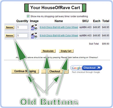
I added upon that and started making new checkout buttons that stay congruent with the main site. Previously all the buttons looked like this:
There was nothing really wrong with the buttons, but they didn’t fit the color scheme of the site very well. I went ahead and re-designed some of the buttons to appear like this:
The changed buttons were basically transposed from the “Add to cart” and “View Cart” buttons customers see on all the products.
MAIN CHECKOUT BUTTONS:
Now I realize the “Continue Shopping” and “Checkout” button have not been changed. I actually DID change them, but reverted them back. I’m trying to make the buttons congruent with the site, but that was the problem, the new buttons blended in too well with the site. I think the checkout button should stand out a little more, and I’m still trying to find/make a good one. Even Noah commented on this saying checkout buttons should stand out.
I do like how it looks at the moment. The “Remove” “Empty Cart” and “Recalculate” buttons are routine user operations, and the associated buttons look completely different from the main site functions (Continue Shopping and Checkout”).
An extra backend function that was added to the site courtesy of the recent Shopsite upgrade is I can track user store searches. So whenever people search for something, I see the results in the backend. This feature was just implemented this feature very recently so there’s not much data yet, but it’s another metric I can use to improve the overall ease of use for House Of Rave.

