Statistics can be complex for dumb people like me. BUT they can be made super easy, if you display the stats in an easy way.
Here’s the kind of stats I personally like seeing:
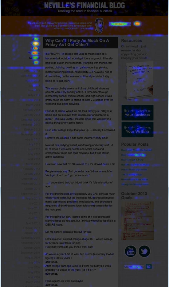
This is a HEAT-MAP overlay of my site from my CrazyEgg statistics. The more people click on a certain part of the site, the more it “heats up” on the image:
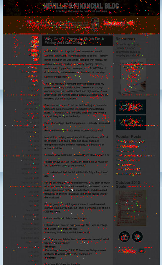
This is a CONFETTI overlay of NevBlog.com from my CrazyEgg statistics:

Same stats in both pictures, but different types of presentation.
The point is within a SECOND you can tell what’s being clicked on….and what’s not being clicked on.
Now, my blog has been sort of “tweaked” because of these stats, so everything is getting clicked on a fair amount, but it wasn’t always that way.
The main goal was to tweak the site so the email signup gets lots of attention. The next goal was to make sure all the links were at least semi getting clicked on. Then I removed all the stuff that NEVER got clicked on.
#ghettostats
BONUS COOL FACT:
On the confetti overlay, you can see these “lines” every few inches. Those are from mobile users scrolling! Cool!
