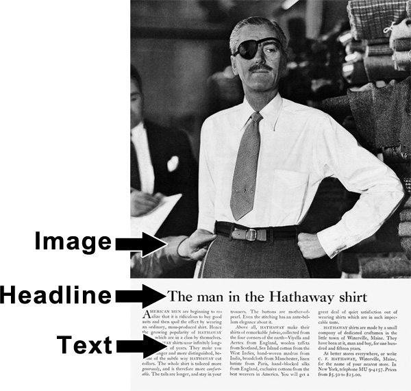
I’m a huge fan of this classic layout of “Image, Headline, Text”. In practice it looks like this classic “Man In A Hathaway Shirt” ad:

The image captures the readers attention.
The headline allows them to decide if it’s something they’re interested in.
The text goes through the details.
Simple, elegant, & gets the point across!
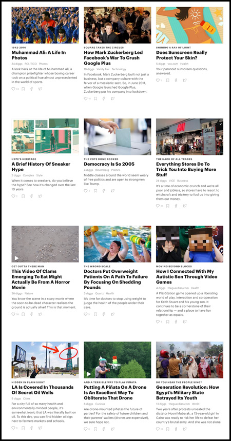
In fact one of my favorite sites (Digg.com) has tested & iterated on this classic design to come up with a very user-friendly format for their stories:

Image.
Headline.
Text.
Repeat.
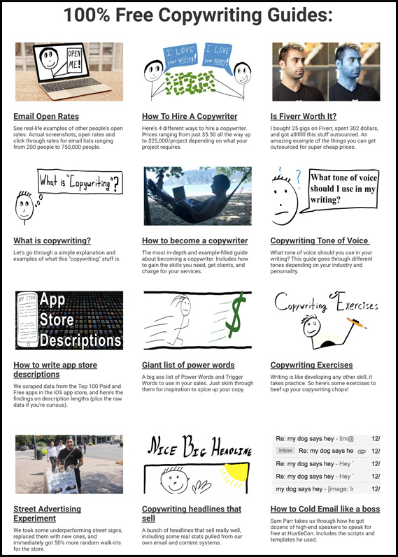
So I decided to take a cue from their playbook and layout a bunch of my articles in a similar fashion.
Check it out:
Lol….it almost looks like a child who can’t draw very well made that page :-)
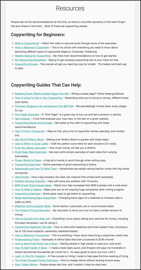
What I’m curious to find out is how it will perform compared to my old resources page that was an all-text format like:

This all-text page performed “just okay”. It wasn’t super interesting, it wasn’t very share-able, and the stats were pretty low compared to other “main” pages. The time spent on-page was very low in comparison to the rest of the site:
![]()
I shall collect the data for the new resources page over the next 3 months and report back!
For now, the new resources page is where I’ll update articles!
Sincerely,
Neville Medhora – Kurious Kopywriter
