I don’t like many blogs but one of the few I regularly read is Adam McFarland’s. I particularly enjoy his blog because he’s about my age and does mainly web related businesses, so I can definitely relate.
Adam and 3 other guys (who also each own small businesses) formed a company called Pure Adapt in which they all pool their talents. Through a collaborative effort they’ve managed to take George’s online business Detailed Image to a whole new level and it’s now one of Pure Adapt’s most promising businesses. Detailed Image sells everything related to high-end auto detailing like car wax, paint buffers, leather cleaners etc. If it makes your car look good, DI probably has it.
I like Detailed Image as a business because it gets EXTREMELY high conversion rate of orders per customer. So if Detailed Image only gets less than 50 visits a day, they’ll still make 10 or more orders from that. One of my businesses HouseOfRave is the exact opposite. I get tons of traffic but low order rates. So I may get 2,000 visitors per day, but only 10 orders. They do this by staying very active in auto-detailing forums and adding lots of content to them. People are much more likely to buy stuff recommended by an active member of the forum.
This post was completely un-asked for by the guys who run it, but here is my review/impressions/suggestions for Detailed Image.com:
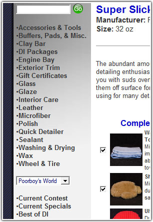
1.) Left Navigation.
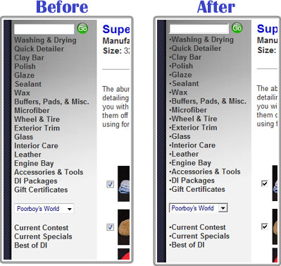
It reminds me of one of those standard OScommerce menus. I’d suggest putting some bullet points to tidy it up:
Maybe even alphebetize it:

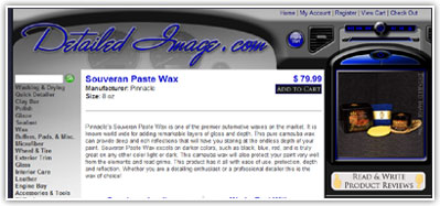
2.) Product Image Location.
No need to change this, but I was definitely confused when viewing products. I browsed through a couple of items and thought, “Why don’t they have product photos?”

They’ve integrated the product photos into the side bar which is made to look like a GPS navigation system on a dashboard, but when browsing the web your brain generally separates the information in the side navigation bars from the main content. Even now, I still look at the site and forget each product has a picture.
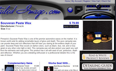
This isn’t really a problem, but a simple fix which could help a not-so-astute person like me is integrating the picture into the whitespace of the main content. This gives the effect of the product picture being a “part of” the main content instead of separated from it. Something like this:
Of course this particular example doesn’t fit into the whole “dashboard theme” very well.
3.) Shopping Cart Upgrade System.
Adam has been talking about how he’s completely revamped the shopping cart system for the site. It’s AWESOME! Instead of making someone go through the site and ADD small ancillary items to the cart individually, it automatically adds related items for you. This way when you UNCHECK items in your cart, you feel “Well, I will need one of those…” and keep it there. This equals larger orders.
Adam mentioned this feature has effectively DOUBLED the dollar amount of each order. Doubling income overnight? I’d say that’s one highly successful modification!
4.) More videos and before/after pictures.
I’ve seen some really nice before/after pictures George has posted in various forums. Some of them were so convincing they had me nearly buying $100+ worth of stuff from DI! However I can’t readily find any links to those highly convincing posts from the website. It would be nice if DI had a small section of before & after pictures of cars with different colors. I drive a black GS 300, and when I saw some before/after pictures of a black Infinity G35 during a detailing, I was VERY close to buying everything in the article. The key was seeing how good my color of paint could look when properly cleaned and polished.
The video of a buffer you guys recently posted is a great addition to the site. I never would dream of buying an expensive buffer had I not seen that video!
That’s all I’ve got for now, great job with the site guys. I can’t wait to see it grow in the coming years!

